

A dashboard even non technical users can configure.
Configuration dashboards intimidate the people who use them. We redesigned 4G Site's dashboard so complex settings became clear, safe, and self serve.
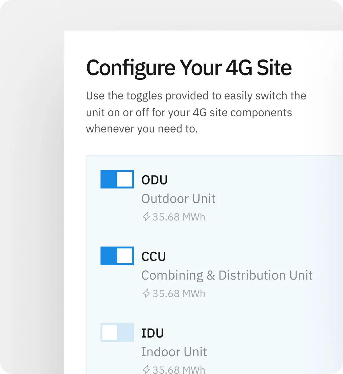
4G Site's dashboard held real power, and hid it behind a wall of technical complexity.
Configuration dashboards have a reputation for being impenetrable, and 4G Site's was no exception. Users were afraid to change settings they didn't understand, and support tickets piled up for things the dashboard should have made obvious.
We reorganized around user intent rather than system internals: clear hierarchy, plain labels, and status views that show what's working at a glance. Complex, explained. Powerful, approachable.
Intent Based Dashboard Architecture
Rebuilt the layout around what users are trying to do, configure, monitor, or act, instead of mirroring the backend.
Clear Configuration Flows
Settings grouped, explained, and given safe defaults, so changing them stopped feeling risky.
At a Glance Status Views
Data visualization that surfaces system state immediately, without digging through tables.
Self Serve Support Design
Inline help, validation, and plain language errors so users solve problems themselves.
Fewer support tickets
When the dashboard explains itself, users stop asking what things mean.
More self serve adoption
Users felt confident changing settings on their own, unlocking more features.
Lower error rates
Clear validation and safe defaults meant fewer configuration mistakes.
Faster decisions
Status views showed what needed attention immediately.
We led with the question a user actually asks: is everything okay, and if not, what do I do? The dashboard answered it on every screen, a status glance up top and actionable paths below.
Language did a lot of the work. Technical terms became plain labels, risks were spelled out, and every destructive action got a safety net. Powerful software, minus the intimidation.
Ready to plug design into your product?
Book a call and we’ll match a plan to your product stage and volume. No pitch, no pressure.