

Rebuilding a platform from the inside out.
Menfess.co needed more than a coat of paint. We rebuilt the platform's information architecture, turning a product users tolerated into one that grew.
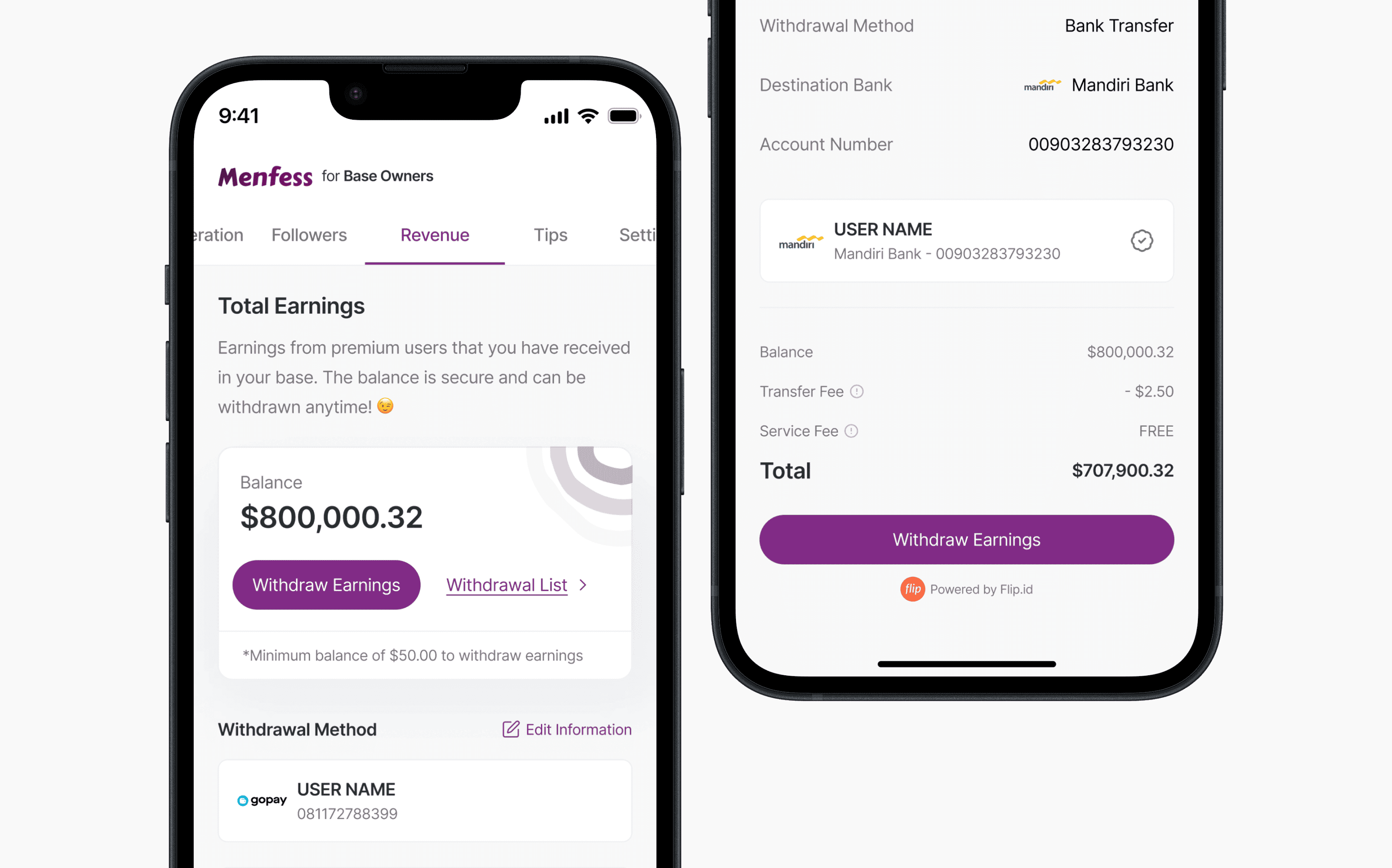
Menfess.co was growing fast, and it showed. The product had collected features faster than its structure could hold them.
New users landed in a product that was hard to understand, existing users couldn't find what they loved, and every new feature made it worse. The fix wasn't more design, it was fewer, better organized things. We mapped every screen and user path, then rebuilt the structure around how people actually used it.
The result: +400% new signups and steady 5% month over month revenue growth. A platform that felt cluttered now felt like a place people wanted to be.
Ground Up Information Architecture
Mapped every screen, path, and content type, then rebuilt the structure around how users think, not how the codebase grew.
Redefined User Journeys
Redesigned the flows that matter most: discovering content, posting anonymously, and messaging. Fewer dead ends, clearer next steps.
New Visual Language
A cleaner, more expressive UI that makes anonymous posting feel safe and the community feel alive, without losing its personality.
Design System & Components
A reusable component library so new features ship consistently and fast, without pixel drift.
Conversion Focused Microcopy
Rewrote labels, buttons, and empty states to guide users to the next action. The small text that drives signups.
+400% new signups
First time visitors now understand the product in seconds, not minutes.
5% MoM revenue growth
Steady, compounding growth every month after launch, not a one time spike.
Higher engagement
Better journeys meant people found content and stayed, instead of bouncing.
Faster iteration
The new design system cut the time to ship new features.
We started with structure, not pixels. Every screen, flow, and content type was mapped before anything was redesigned, so we knew where users got lost before touching the visual layer. A cleaner visual language then made the structure legible: strong hierarchy, calmer surfaces, and a design system that keeps every feature consistent.
Conversion came from the details: clearer labels, friendlier empty states, and copy that told users exactly what to do next. Remove the friction and growth follows.
Ready to plug design into your product?
Book a call and we’ll match a plan to your product stage and volume. No pitch, no pressure.